Designing This Website
Do we need static websites anymore?
To answer this question, it’s worth looking at the history of Internet communities.
Roughly thirty years ago I published my first web page using Geocities. It was definitely a product of its era, with rotating gifs and background music.1 I enjoyed creating something people around the world could access and learn more about myself, but the end result was that people looked at the website, said “that looks nice”2 and then that was all there was to using the website. The website was a thing to look at and nothing more. Its limited function meant that it had limited potential.
For this reason and other similar ones, around the turn of the century there was a migration from Geocities and static websites to ones with comment sections. Dynamic websites where users had control of a lot of the look yet now had comment sections became the place to be. Sites like Myspace, Blogger, and Xanga allowed users to trade some customization features for user interactivity. Xanga in particular was interesting to me since one could type large amounts of text and it would be fairly readable unlike in Geocities where typing in a text box was cumbersome and the result was often gruesome to read. Comment sections meant my friends could discuss with each other the blog posts we wrote and use the Internet as a way of keeping up with each others’ thoughts on various topics.
The problem that arose with these places is that the comments sections were, aside from spam or a particularly contentious post, usually empty. So, we migrated to larger social network platforms that were proactive in having users sign up and, using algorithms, connected us to users on our perifery whom we would be interested in knowing better. Part of Facebook’s charm back in the day was that it was the first social network site to have practically everyone I knew aboard. Now when I wrote something or posted a photo, a great many people I know would read it.
A consequence of this feature was that I had less control over who I wanted to read what I wrote. On Xanga, for example, I knew that what I wrote on my own blog maybe a dozen people would read.3 That gave me the freedom to say whatever I wanted to that audience (and I could comment on someone else’s blog if I wanted a different audience). For Facebook, the lack of control over who sees what I write meant that I had to cater to a wide audience of people who know me for vastly different reasons, from distant relatives to close friends. Knowing this, I immediately found that I didn’t want to post on Facebook. I may have posted on Facebook half a dozen times since I joined long ago.
I migrated then to message boards, where people with specific tastes could converge. Users were often anonymous4 which led to honest conversation. Old message boards used to have dedicated moderators and active admins along with a familitarity among community members. On some forums I felt like I knew the users there more than many of the people I talked to in real life. There was a golden era from 2004 to 2008 that balanced free flowing discourse with personability.
That era ended with the growth of modern social media platforms such as Twitter and Reddit. I and many others migrated to some of those platforms, trading in the tight personal community and some customization features5 for gigantic audiences where even the most esoteric niche could still contain a large number of users. In subcommunitity Subreddits and niche Twitter communities and Facebook Groups there was now an expectation that everyone participating shared similar interests. This closing off led to echo chambers where even slight disagreements were met harshly. On the upside, tight communities sharing the exact same interest allowed people to find deep belonging.
The trade seemed fair at the time, but collective migration to a few social media platforms led to the shutting down of smaller ones, which in turn has allowed for those social media behemoths to take advantage of the lack of competition. They can make their platform look and feel worse and you’ll still go there because, well, where else on the Internet is there to talk to anyone?
A level of tolerance still persists for me and many other users who endure. Yet it must be noted that with the transition from Geocities to today’s Facebook or LinkedIn or Reddit or X, we’ve lost so much power. We used to have a choice in how we wanted what we wrote to be designed. We used to be able to express our own personalities. Content we wrote appeared as we wanted it to instead of algorithmically promoted or buried. We used to have a tight network of people who we let know what we wrote so that what we wrote was contained to the specified audience.
With the proliferation of AI, we’ve lost even more power. Every post on every social media platform has to be internally vetted not merely for honesty–people indeed do lie on the Internet–but for whether it was written by a human at all. My voice has been dilluted with noise. Not merely am I being drowned out by spammers and low-effort posters and liars and corporate plants, but now I have to compete against language learning model posts that many human beings prefer to humans in terms of voice and cadence. Here and there exists a place where moderators and admins are capable of clearing out the AI junk,6 but with hordes of money being spent on greater AI capability, those spaces are going to be drowned out, too.
To rise above all of this, people such as myself who try to put an effort into making thoughtful content have to be careful about where they write and choose places that allow them to have verified authenticity. For example, I have tried to post on LinkedIn.7 However, my content quickly gets drowned out by AI posts that game the algorithm. The high effort I exert gets buried beneath the no-effort LLM posts that all say similar vague messages on whatever corporate trend is in vogue at the moment.
It is for this reason that I think static websites are now critical for people to build. Anybody who is going to put the effort into writing or composing something needs to have it placed somewhere where it is inarguably authentically theirs. This website, with its domain name matching my own and its style of writing matching my own and only my own, authenticates the projects that I do. That authenticity, in an ocean of LLM generated nonsense, is critical for audiences to understand that what I write is worth paying attention to.
I am not speaking of myself on some pedestal. I think everyone should follow this rule:
If you put any significant effort into anything you make, you should post it on your own website so that it is verifiably yours.
Audiences can then verify whether posts are real based upon the reputation of the person running the website. If you post LLM text and AI generated images on your website, your reputation is gone.
Here’s the thing I think many people do not understand: Building a static website today is ridiculously easy, cheap, and the end product will almost certainly look better than any social media platform. People will be drawn to what you write or what you do if it is on a nice looking ad-free (or ad-limited) static website than they will be if it is contained on a social media platform. You may not get the high view count of a social media post, but almost certainly the engagement will be greater as your audience is not distracted by the incredible loudness of social media noise nor will your content be instantly buried by algorithms that favor optimized LLM posts.
There are platforms where you can sign up for free or pay to publish a blog or a website. I like Bear Blog, for example, for its minimalist blogging capabilities.8 There are big website builders like Wix and Squarespace that can generate decent websites that look similar to every other website out there.
My recommendation: Build your own. From the ground up, all code and commands. Pay the modest price for your domain name, find a good server to host your site for free (or for a small fee), and then download something like Hugo and tweak the code and add pages until your content looks as you see fit, and publish and promote your work.
To many, this will sound like a ridiculous suggestion, but if you continue reading you might see the idea is far from silly. This post will walk through my process on how I made my website, which will hopefully get you to understand that it doesn’t take an advanced degree in computer science to construct a website that looks and functions better than all the major social media platforms. In it I hope you come to these conclusions:
-
AI makes troubleshooting possible. It does not ameliorate all of the headaches, but no longer do you have to scour esoteric computer forums to figure out a resolution to an error message you cannot otherwise overcome. AI was designed by computer programmers. It is not a surprise then that coding is one of AI’s greatest strengths. Static websites are some of the easiest code out there. So, a tool designed for coding to assist with some of the simplist coding makes it an actually useful resource.
-
Templates now exist that can give your static website incredible functionality, the sort of functionality good websites in the past used to have. You can make your work look outstanding simply by following a template and then adjusting a few parameters. You will be surprised at how good your work will look on your website versus on ugly social media sites as it turns out so many great features exist that you can have access to that can highlight your work.
-
Getting a website running is cheap, easy, and does not require a lot of effort. Updating it is also simple. The effort and money you do put into it will pay off because the customization to make your website look great will speak for itself.
-
Composing it in code allows you to transfer the website or migrate its contents with ease. So, as social media platforms get worse and much of the Internet loses its memory, you will be able to keep the work you create in a format that’s easy to move and modify.
-
As I launch this website, I wish I would’ve done this project years ago. You will feel similarly once you launch your website.
My journey in planning a website: You only need a simple plan to get one started.
Who, what, when, and why.
The most challenging part of contstructing a website is understanding its formatting. This website required months of consideration and preparation before I was comfortable in commencing building content or adjusting coding. That might seem strange to you as, if you are reading this near its launch, there isn’t much here. But everything on this website has been carefully considered. Some of the questions I’ve asked:
Who is this website for?
This question ended up being the most challenging to answer. I wanted a website that would serve me in professional contexts, for people who would benefit from my analytical insight. I also wanted a platform to talk about various media, as I have done a great many media analyses over the last two decades. And I wanted a website to aid those who were in the SF Club I run.
These audiences are not always compatible. Professional people are going to want to see that I can stick to business. People more interested in media analyses are going to want frank discussions. The SF Club doesn’t really care about my professional life and would prefer if I were neutral enough to let them voice their opinions.
Ultimately, I decided upon only content that would make me look favorable in a professional setting. I chose a template that would reflect that, chose the domain name to be my own, and chose to stylize this website so that it looked good to a professional’s eyes. Yet I found ways to keep some of the other bits included. The SF Club could eventually move to its own domain name, but for the time be in the corner. And I could include some of my own personality in a Suggestions section that allows me the space to describe stuff I recommend.
(If necessary, I may construct a second website for other less professional matters, but I would keep it distinct from this one.)
What is this website about?
Early on I decided I wanted a website so that I had a place to put various pieces I write about. It’d be akin to a profile page on a social media website, only I get full control of my own content. The what is content, whether they be analyses pieces or news posts like this one.
I decided to divide the content of this website into five categories: 1) About Me, which will serve as a CV and also outline my specific strengths. 2) News, which will serve as updates useful to others. 3) Ideas, which would serve as professional analysis pieces to get people to understnad my reasoning mindset. 4) Suggestions, which would allow me a place to add a little personality. 5) SF Club’s corner.
These divisions help split up the content so that audiences more professionally minded (or not) are likely to hang out in one section. The front page will contain a mix of these areas so that there’s something for everyone.
When is this website being updated?
The design of a website should be dependent on how frequent it will be updated. A more frequently updating website should have more content on its main page for readers to peruse over. One that updates infrequently should have some of the most recent pieces fronted so that viewers can immediately visually see that there’s something new posted. Since I do not want to be beholden to the rigor of updates, I chose a corporate style format for the front page that would highlight new pieces as they arise.
Why should other people visit this website?
This is an ongoing question and can only be solved once I figure out how to frame what I do here on social media in a manner that people will find interesting enough to click upon. People who do visit should be rewarded with aesthetically appealing, well-formatted content. They should enjoy their time away from the ugly and noisy social media platform they were on when they are on a website that is ad-free, noise-free9.
My journey in owning a website: The Four Pieces
Only one of the four cost me money.
To build a website from scratch you need four ingredients: A domain name, a server to host your website, a deployer that can build your website and send it to the people who access it, and a builder where you contruct the website and render it offline before having it deployed on a server.
Domain names can be bought at various places. Do a web search of them and they’re easy to find. My advice is to get a website that’s relatively few characters and not worry too much about getting a fancy top-level domain. .com is often more expensive than the alternatives, but people these days are perfectly fine with .net and .info.10 Most people are going to click to go to your website from some external source such as a social media post.11 For them to return, they simply need to remember your URL, which, again, is why I suggest a domain name that’s short in characters and a top-level domain that’s relatively common.
There are a few decent web hosting places. I wish there were more competitors. I selected one that would be free to store (and cheap if I do expand enough that I need to pay for space) and, moreover, easy to transfer.
I don’t know as much deployers. I found one that works and I use it. It does its job and that’s about all I can ask for it.
A lot of web builders charge you money. In an era where AI and community forums can smooth out the barrier of open source technology, that’s a waste. This website was built for free in Hugo. The product is free, open-source, and it works really well. It does have some flaws, but thanks to AI these flaws are easy to resolve and worth the price of free. If the cheapness of Hugo necessarily led to an ugly-looking website, then I could understand the need to hand over cash for something that’s appealing. But in all honesty, I think Hugo websites look better than the stuff from the $17 a month club. So long as you are willing to build a static website (which, in a modern era where you can link to your Etsy or Patreon page is valid for most use cases) and are willing to tweak a few lines of code you will get better results from the free option.
My journey in building a website: Go Hugo!
Wherein I go step by step on how I constructed this website.
Step 1: Choose a theme and download it (as well as Hugo).
Go to the Themes page. Select the one that contains the FEATURES, not necessarily the aesthetic, that you need. I chose Tella because the front page could be formatted to showcase updates as they slowly roll in (see the above WHEN section), because the theme can handle blog-like posts of various assortments so that I could add content such as this very page (which looks similar to the theme with considerable adjustment) (see the above WHAT section), because the layout of the theme looks professional (see the above WHO section), and because I felt like whatever it did lack I could figure out how to adjust.
Follow the instructions and download the theme and download Hugo.12 If you download Hugo and extract the theme correctly, and then follow the directions correctly and copy over the example website to a separate folder, you’ll see in that example site directory with a set of folders. Your website is now that set of folders where you can drop in content and modify content that’s already there.
Step 2: Run Hugo on the example website of the theme.
The next step is to run Hugo and generate the example website. Go to your terminal, cd to change directory to the one where the example website is in, and run hugo server. This might succeed… but more likely you’ll get a bunch of errors. This is where you need AI. A problem with Hugo is that the templates get made at some point long in the past but Hugo gets monthly updates. That leads to the templates not always being in line with the features of the latest update. You could spend your time researching all of Hugo’s features in the current version, find out what version the template was built in, and then research the features of that version. Or you could ask whatever your favorite AI chatbot is to tell you what the differences are and how to resolve the error.13
For the Tella theme, part of the issue involes changing languagecode in all files to locale (a fancier term!). So, you control F “languagecode” and open all of the files in your folder that contain that text and make the adjustment. Once you do that and address the other error messages, running hugo server will spit out something like this:
Built in 289 ms
Environment: "development"
Serving pages from disk
Running in Fast Render Mode. For full rebuilds on change: hugo server --disableFastRender
Web Server is available at http://localhost:1313/ (bind address 127.0.0.1)
Press Ctrl+C to stop
The website has been built! Congrats. Now go look at it by opening up a web browser and typing in http://localhost:1313/.
Time to make the website you built yours.
Step 3: Customize everything!
Before we begin customizing, let’s look at the directory layout of Tella (typical for a Hugo website). Archetypes can be used to set default settings but for the most part it is not something I deal with. Assets is where the formatting is located, with a css folder that controls a lot of the style. Content is self-explainatory. Eventually that’s where I’ll solely be working in, creating new posts and pieces in various folders there. Data hosts a few json files that control fancier features. Layouts is where the structure of the website is located; adjusting those allows me to fine tune the header or the footer or other various elements. Node_modules is backend I don’t spend too much time working with. Public is where after typing hugo into command prompt the website is built. Never touch anything in there but instead let the program build the files in that folder. Static contains files like images or font files. Themes is essentially a backup directory where if Hugo can’t figure out how to build something it turns to the files in this folder to figure out the rules. And that’s basically all there is.
I like starting with the CSS. That’s the look of your website from the color scheme to font sizing and selection. In Tella’s theme, the CSS sheet is located in /assets/css/style.css. There are plenty of resources out there on how to code CSS. Basically, you pick an object on your website (header, footer, etc.) and change the attribute. Or you can set up a setting that applies broadly to everything on your website.
If you’re like me, an important change to make is font selection. I used to peruse font websites for deals and buy fonts that I loved. I have a folder next to the CSS folder where I’ve dropped in the custom fonts I’ve found (in WOFL format) then referred to them in the CSS stylesheet.14 This website uses three custom fonts: a title font used for headers and such, a workhorse serif font used for text, and a font used for the text at the very top and bottom of the website.
If you don’t know the code to something, look it up in the CSS guide or ask AI.15 Each time you save the CSS sheet (or make any modifications at all to any of the contents of your website), the website will update on your web browser. I like to make some small changes, save, go to the web browser and look to see if it did something I like, and then go back and make more changes. One of the great features of Hugo is that it updates really fast so I can iterate rapidly.
The /layouts/ folder contains the structure of the website and so to personalize the website so that it doesn’t just look distinct but contains a structure distinct to my own needs, it’s important that I edit contents here. /layouts/partials/ files for parts of the website such as the header, footer, and so on. Changing some of the div class terms in those files can adjust their features. In Tella, /layouts/ starts with /layouts/products/. I copied and renamed that to /layouts/ideas/ and /layouts/suggestions/. The folder /content/ shows the files that will be displayed in each of the structural bits described in /layouts/. Thus I have a /content/ideas/ and content/suggestions/ directory to match the ones that are in /layouts/.
Finally, it’s worth going through hugo.toml to update the button names and make a ton of customization changes.
Step 4: Create content.
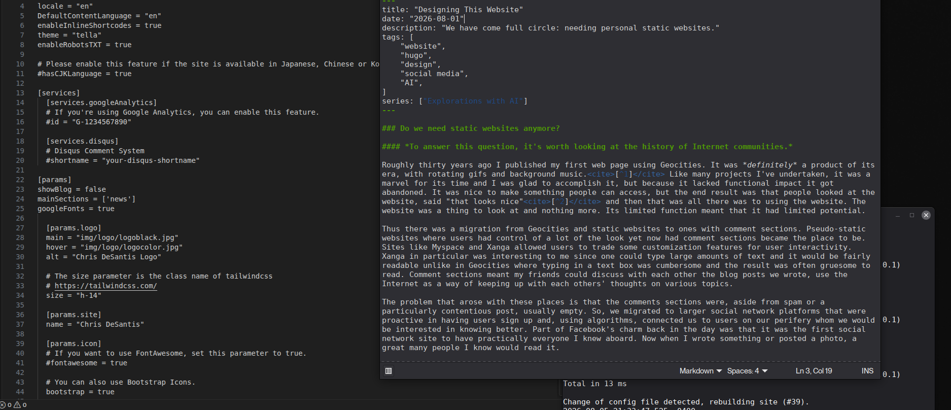
In the /content/ folder there are md files. Copy and paste new ones to create new files, then rename them to whatever you wish. All of the files are in Markdown. They start with a bunch of terms that describe the character of the file, such as the title, date, tags, and description. Below the next three dashes is where you write all of the text that will appear on the screen. I’m there right now typing this very sentence!
Everything I am typing is in plaintext, which means the text I am seeing on the screen can’t be formatted; I can’t highlight these words and make them italics like I could in a Microsoft Word or LibreOffice Writer file. To adjust the formatting, I use some basic code, one that I’ve used for a lot of message board forums: Markdown.16 Markdown is super easy. For example, if I want to italicize something, I type an asterisk before and after the word. Tella has its own Markdown syntax guide. I open that md file whenever I need a reminder on a specific Markdown trick.17
My suggestion is to make at least one of each type of content that will be published on your website before launching.
Step 5: Deploy and launch.
Hugo has guides for deploying. Follow them to upload your website contents to your web host. Connect to your web development framework and ensure that the site launches virtually. Then it’s just a matter of connecting your web host address to your domain address so go to wherever you bought your domain name and hook it up there. Once you do all of that your website should be up and running.
Now all you have to do is go on social media and promote it. And, of course, update the website whenever you have new content.
My journey is now over; yours is just beginning.
Now that wasn’t so bad, was it?
It really is that easy to make a website for free (minus the fee of the domain name registration) that looks as good as a professional site. All you have to do is 1) sign up for your domain name, host, and deployer, 2) download Hugo and the theme of your choice and do a little debugging, 3) customize as much as you can by editing the CSS, hugo.toml file, and more, 4) add content, and 5) deploy and launch.
Now go, make a wonderful website! Customize it to make it yours. Contact me and show me what you’ve made. I welcome this new era where we’ve come full circle to the early days of building from the ground up to make something wholly their own, returning to website design to verify our authenticity, surviving the deluge of bots on social media.
-
I remember it being Aerosmith’s “I Don’t Wannna Miss A Thing” in MIDI form for a while, and then the original Star Trek theme in MIDI form. ↩︎
-
They liked the rotating gifs, of course. ↩︎
-
Often it was more like 3 people. Which, when I read some of the mosts I wrote in adolescence, is still too many. ↩︎
-
My advice is, for most situations, to never commit to writing fully anonymously (which is tricky to do) but instead semi-anonymously. In essence, write in a manner that will not give out many personal details but if you know the person well there are ways of finding what they write (i.e. screen name or some specifics that, if you knew me well, would confirm identity). This approach is similar to the old blogging era where people could speak freely and to their desired audience while not needing to be careful as to cover all of their tracks. Posting semi-anonymously means you need to have some guardrails on what you post in case someone in real life that you know finds them; I think strikes the right balance for forums, where users want to talk to others as if they are close friends who you are wary about but also comfortable enough to be honest with them. ↩︎
-
Message boards used to allow you to choose which typeface you used and would include a “signature” at the end of each post. These customizations added to design clutter, and a lot of the old message boards indeed look hideous but that bit of ugly customization allowed people to have enough of a personality that their fellow message boarders could identify them, maybe even befriend them. When such message boards were abandoned for the sleeker, streamlined message boards, I can’t help but wonder if we’ve abandoned an accessbility feature, that those who are less capable of expressing a distinct personality now have lost a tool to stand out. ↩︎
-
Shout out to the best social media site right now: Tildes. Tildes requires an invitation from specific people on the platform in order to sign up. That increased barrier to entry allows for the people there to be behaved and interested in finding and generating meaningful content. (I do not have a Tildes account.) The future of good social media will be invitation-only platforms, likely having most of its content locked to the outside to prevent bot scraping and nefarious intruders. Having a static website in this case will boost your reputation and allow you access. ↩︎
-
Of all of the social media sites I’ve experienced, LinkedIn is one of the worst in terms of audience control and content ownership. If I create content for LinkedIn, a black box algorithm sends it out to the feed of some people, the who and how of that algorithm not to be understood. For this reason, it’s best to think of LinkedIn as a marketing platform and send people elsewhere to see your content or to have fruitful discussion. ↩︎
-
I don’t have an account or a blog on that platform, but I mention it here because it is the ideal easy-to-use minimalist approach to modern content posting and web design. ↩︎
-
Formatting is a huge deal in removing the noise. For example, I want posts such as this one to exist that have a massive amount of content yet I want people to not feel beholden to having to scan for the tidbit that they were looking for. Designing a website to have headers, sub-headers, sub-sub-headers, and these end notes allows for the content to be easy to pick apart with the eye. ↩︎
-
If you are making a website for yourself, you aren’t a company and therefore there’s no reason to tether yourself to .com. I like .net and see a good number of people I admire use it. ↩︎
-
Search engine hits are also possible, but with the evolution of AI more and more people who are looking for an answer to a question turn to LLMs and not through clicking links on a search engine. Even Google has changed their website to promote AI features over links. Long term, search engines are going to be less impactful and social media posts are going to be the most useful form of self-promotion, even for major businesses. ↩︎
-
I am constructing this website on Linux, so much of what I’ll say is Linux-focused. Linux is great and free and not nearly enough people whose use cases fit well within Linux’s capabilities take advantage of an operating system that’s both free and not filled with ads. (Also under the new era where AI lowers the barrier of open source clunkiness, Linux is definitely worth considering using as its barrier to entry is already low.) ↩︎
-
It may appear strange for me to at first be so hostile to AI only to acknowledge that there are places where it is the best solution to a problem, but I acknowedge that that AI is a worthwhile tool to use so long as its use is ethical. Using AI as a search engine to resolve a problem? So long as you don’t trust everything it says, AI usage makes sense. Using AI to flood social media with slop in order to game the social media system or blanket users in bland advertising? Not ethical. ↩︎
-
Shout out to Butterick’s Practical Typography as an invaluable resource on formatting. This website may evolve to adopt even more of those formatting guidelines. ↩︎
-
There’s always a temptation to simply paste in whatever code AI give you, but it’s often best to see the code it sends and then go piece by piece to see if what it sends makes sense and what can be modified to one’s own taste. This point is particularly true with CSS as AI is decent at giving CSS style code suggestions, but its aesthetic choices are way outside my taste. ↩︎
-
old.reddit.com uses Markdown, for example. ↩︎
-
Many people will prefer composing their content in Microsoft Word or LibreOffice Writer and then pasting their content into the Markdown file as the md file usually doesn’t have a good spell checker. Since I’m going to be editing everything on my website repeatedly, I’ll usually catch all of those errors. If you find typos, my apologies. ↩︎