The Music Of Data Analysis
The cold truth to data is that it is indifferent to meaning. It can take a lot of work, critical thinking, and a deep understanding of how data is gathered and processed to interpret data in an honest and useful way. Even then, data often doesn’t fit neatly together, and those who try to understand it must pour through potential confounding variables, measurement errors, measurement tolerances, and a nearly endless supply of little nagging questions. Since people desire satisfying answers to big questions, those that can critically think about how to deliver answers that minimize uncertainty through deep thinking will continue to be valuable. Aptitude for data analysis remains an in-demand skill, even as processing data becomes easier with technology.
Let me tell you a story to give you an example. It involves a highly-successful chemist who also happens to have a passion for music and for data analysis. And one of the big questions that hobbyists in music communities ask: What are the most popular songs of all time?
Ranking the Greatest
Reading The Billboard And Seeing The Signs
Since 1958, the Billboard Hot 100 has tracked the popularity of singles in the United States. It proved immediately valuable to music insiders such as DJs and record executives. That popularity expanded to the public with the advent of Casey Kasem’s American Top 40 in 1970. The ongoing weekly countdown1 created a figurative mountain to climb for artists trying to battle each other to the top of the chart.
Hobbyist communities consisting of fans of American Top 40 and popular music in general have formed to debate and discuss the charts. Though The Billboard Hot 100 provides a consistent stream of data–the 100 most popular songs ranked every week–there is plenty of room for conversation and controversy. What “Hot” even means for Billboard is opaque, as Billboard’s formula for combining singles sales and radio airplay2 along with the details on how that data was gathered, is kept internal. So, when debates arise over who was the biggest artist of an era or what was the biggest song of a decade, transforming the data that Billboard presents to something to answer these big questions can be tricky.
I’ll give a much narrower example to show the difficulty. Suppose we ask the question, “Which song was a bigger pop radio hit, ‘A Thousand Miles’ by Vanessa Carlton or ‘Foolish’ by Ashanti?” They’re a good pair to consider since they both were hits at the same time (though “A Thousand Miles” charted four weeks earlier than “Foolish” and spent a few extra weeks on the chart after “Foolish” fell off the chart). Radio And Records kept track of radio plays for both songs during the time it charted in 2002.3 In Figure 1 I’ve plotted the position “A Thousand Miles” reached on the Contemporary Hits Radio chart during its time period that it was there. In red I added the rank it would’ve reached the week it fell off the chart due to a rule where songs that spend more than 20 weeks and fall below #20 are removed to a separate Recurrent chart. I then did the same for “Foolish” and then overlayed the two. There are a few weeks where “Foolish” was ranked higher, but the majority of weeks “A Thousand Miles” was ranked higher. “A Thousand Miles” also spent more weeks on the chart. From this analysis, it’s clear that of the two, “A Thousand Miles” was the bigger pop radio hit.4
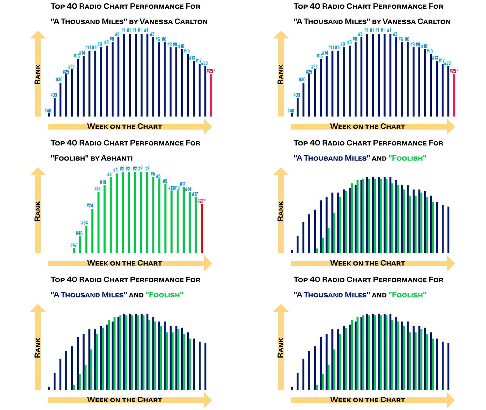
Figure 1. Radio performance for “A Thousand Miles” (first part of the gif), “Foolish” (second part of the gif), and the two combined (third part of the gif). The red data points indicate the rank the song would have had without the Recurrent rule. Source: Radio And Records
Unlike the Billboard Hot 100, the radio airplay charts on Radio And Records comes with additional data: the play count or “spin” count of each song. We can check to see if our eyeballing was correct in Figure 2. Indeed, “A Thousand Miles” was a bigger song than “Foolish.”
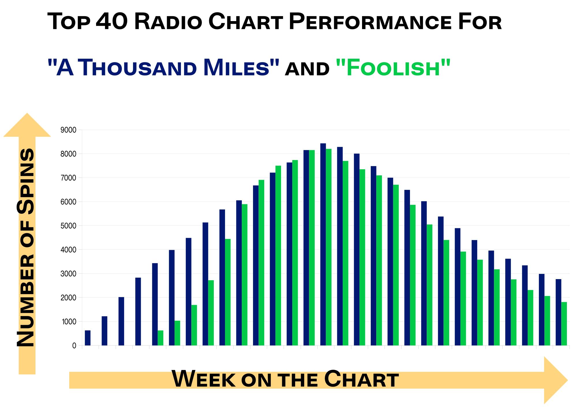
Figure 2. Spin count for “A Thousand Miles” and “Foolish.” Source: Radio And Records
In Figure 3 I total up the number of plays both songs have and compare their cumulative play count. What’s interesting about this chart is that it shows the plateau. Your eyeball can continue the curve and see where both will level out. There is no doubt that at least for this format, “A Thousand Miles” was larger.
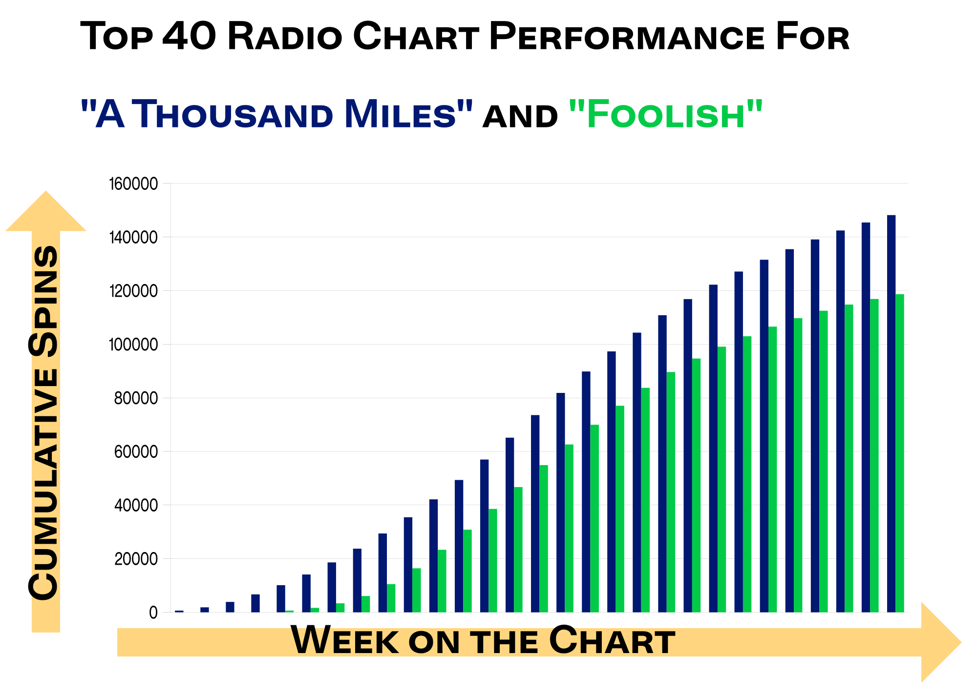
Figure 3. Cumulative spin count for “A Thousand Miles” and “Foolish.” Source: Radio And Records
Did you notice something? Our analysis appears straightforward: “A Thousand Miles” spent five weeks at number one and “Foolish” spent five weeks at number two. Look closely at Figure 2 and you’ll see that the first week “A Thousand Miles” hits #1, “Foolish” appears to have a very similar play count. Indeed, that was an interesting week as the two songs had the exact same number of spins. “A Thousand Miles” was given the win because of a tiebreaker rule where the top spot is given to the song that increased the most in plays the prior week.
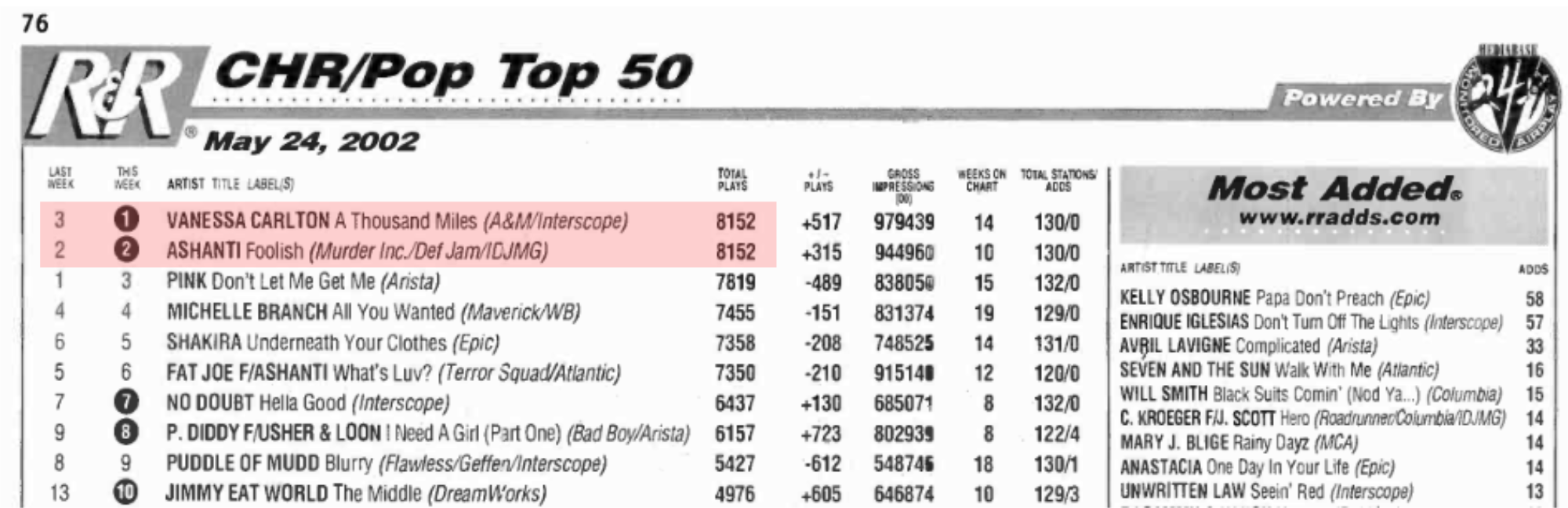
Figure 4. May 24, 2002 Contemporary Hits Radio chart from Radio and Records. Note the total play count is exactly the same. Source: https://www.worldradiohistory.com/Archive-All-Music/Archive-RandR/2000s/2002/RR-2002-05-24.pdf
So, had we not seen the underlying spin count, we might have missed out on the fact that “Foolish” was deprived of a #1 status only by a technical tiebreaker rule. Ashanti had a chart-topping hit in the sense that she had the most plays for a given week (it only just so happened that someone else had the same plays). This is the essence of the problem of analyzing the Billboard Hot 100. Because it only tells you rank and nothing else, you are often missing out on important details.
The difference in playcount from position to position on the chart is not always consistent. Of the four weeks Vanessa Carlton and Ashanti went 1-2, one week the two were exactly tied while two of the weeks had a roughly 600 and 700 playcount difference. Later in the year, though, during her #1 reign, Avril Lavigne’s “Complicated” opened up an 1800 playcount lead over the #2 song.5 “Complicated” at the time had over 10,000 spins while “A Thousand Miles,” which spent five weeks at #1, only maxed out at roughly 8400. Blind to the spin counts and only working on chart position, how would anyone accurately compare charting songs when both the absolute and relative values shift so much?
Let’s look at some of the historical attempts to solve this problem.
Rank Analysts
Finding the formula for hit songs.
In the 1970s, the presumptive approach to this analysis was by assuming the Hot 100 scaled linearly. If this was the case, then one could score 10 points to any song that appears at the 100th rank, 20 points to any song that appears at #99, and so on, and then total the song’s score to make the comparison.
This approach has many issues. First, a song at the top of the charts often is way beyond its competitors and therefore giving it 1% extra weight compared to its #2 neighbor doesn’t make sense. Consider the week where Avril Lavigne’s “Complicated” was #1 with a 1800 playcount lead over #2. That 1800 surplus spin count was the more than the total number of plays the song at #33 recieved that week. As discussed earlier, there may be some weeks where a song is barely #1, but, quite often, a #1 is significantly ahead of its competition and scoring should reflect that.
Second, it fails to take into account factors that make data less relational to data of different time periods. For example, our “A Thousand Miles” / “Foolish” comparison was a good one to make because they both charted during the same time period, but if we were to directly compare those songs to one that charted in December, the spins for “A Thousand Miles” and “Foolish” would appear artificially inflated. That’s because in December many radio stations spend much of their play time on Christmas music, depressing the spin count for contemporary pop songs during that time. A fairer comparison has to take into consideration Christmas music and normalize spin counts to account for the difference in play counts for that time. Relational effects are common on the Hot 100 where sales and airplay formula change over eras alongside rules both for the chart and for those spinning the songs on the radio. Strong approaches to data have to consider every possible confounding effect and make the best attempt at normalizing to get an accurate measure.
Third, it does not take into account many of the strange anomalies and obscure rules that go into effect when constructing the Billboard chart. Like in our “A Thousand Miles” / “Foolish” example, sometimes a song appearing at a certain rank, or even on the chart at all, may be dependent on the fine print and simply reverse-ranking songs limits this capability.
In 1982, University of Pennsylvania sociology professor Peter Hesbacher published an alternative approach to ranking Billboard songs. After working with Billboard to pour through sales and radio airplay data, Dr. Hesbacher found:
Tradeweekly chart compilations typically employ a simple invented point system. The raw point totals composed of retail sales, wholesale sales and are then rank ordered from most to least points until all chart positions have been filled. But this system does not reflect the fact that differences toward the top of the charts are much larger than differences toward the bottom.6
To account for this issue, Dr. Hesbacher altered the weights of each rank to follow a monotonic decreasing curvilinear function, which he felt best fit the data he observed. He gave the #1 song 20 points, #2 15 points, #3 12 points, #4 10 points, and descending further down in points until everything between #11 and #20 was given 3 points, everything between #21 and #30 was given 2 points, and everything between #31 and #100 was given 1 point. This reranking unbiased the analysis towards long-charting songs as the inverse ranking approach did. Now songs that held at the top for longer were awarded far more points and rose to the top in the analysis.
Nevertheless, there are still problems with Dr. Hesbacher’s analysis. For example, when he re-ranked the Top 10 songs of the 1970’s, all but one of the songs are from 1977, 1978, or 1979. That’s likely because songs spent a longer time on average on the chart in the later 1970’s than in the early 1970’s. Those inspired by Dr. Hesbacher’s work would come to recognize that additonal normalization is needed in order for the early 1970’s songs to be on an even playing field.
A Scientist’s Insight
Bill Carroll’s Ranking The 60s and an attempt to answer lingering concerns about making meaningful comparisons from the Hot 100 chart.
Bill Carroll is a highly successful chemist.7 He spent 37 years at Occidental Corporation where he worked everywhere from the benchtop to the boardroom. His successes allowed him to be elected President of the American Chemical Society, which is the largest professional organization in the world. His data analysis skills that brought him success professionally seeped into his hobbies, where he worked on trying to publish manuscripts working up charting data. During that time, Dann Isbell of the Ranking the series (Ranking the 60’s, Ranking the 70s) reached out to Dr. Carroll to use his data analysis for a second edition of the Ranking the series along with additions to include the 80s and country hits of the 90’s.8
Dr. Carroll’s data analysis returns to the three challenges of making sense of the Billboard Hot 100 that the simple inverse ranking approach failed and Dr. Hesbacher’s approach only partially fulfilled:9
-
How do we account for runaway #1 hits that are so far above the rest of the pack?
-
How do we account for strange rules that alter or limit the data to be included?
-
How do we make sure that songs from each era are on a level playing field?
1. Getting the weights right
Bill Carroll’s additions to the Ranking the series include a new weighing system, where more points are given to high-charting songs relative to ones that rank very low. Figure 5 compares the three scoring systems. Dr. Carroll notes that his ranking system and Dr. Hesbacher’s system “fit relatively well.”
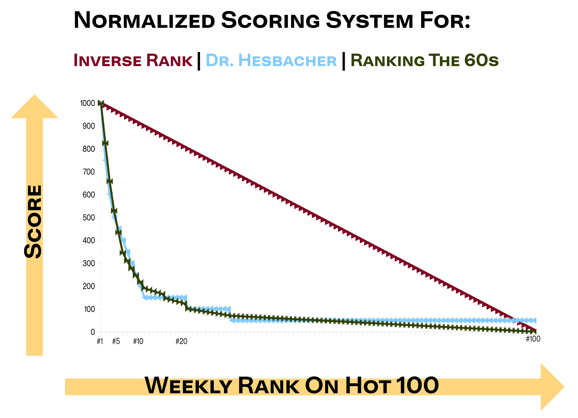
Figure 5. Three different approaches to weighing Billboard Hot 100 hits, normalized so that #1 for each is scored at 1000. Adapted from Ref 6 and Ref 8.
Ranking the 60’s 2.0 notes that these weights were derived “empirically,” though the details are not disclosed. I’m sure considerable effort was undertaken to ascertain these values, especially after reading the notes in Bill Carroll’s Ranking the 90s: Country.10 In the late 90s, radio airplay values were recorded and so the weights for those songs were (if the sales values more or less matched) exact. To obtain the weights for the early years, Dr. Carroll extracted the typical chart position for each rank and calculated an extrapolated value. He also had to do that for the Country Recurrent Chart, where songs that descended ended up (and for the Country chart, they ended up there very quickly). These values can be extrapolated backward, and likely some combination of extrapolation and data fitting with other sources such as Dr. Hesbacher’s system contributed to the final weights.
I was curious as to whether these scoring systems made sense when considering real-world data.11 So, I went through the 2002 year on Top 40 Radio on Radio and Records and looked at the percent difference between two consecutive positions such as #1 and #2 and compared them to Dr. Carroll’s weights, Dr. Hesbacher’s weights, and the inverse rank system.12 Figure 6 shows these comparisons.
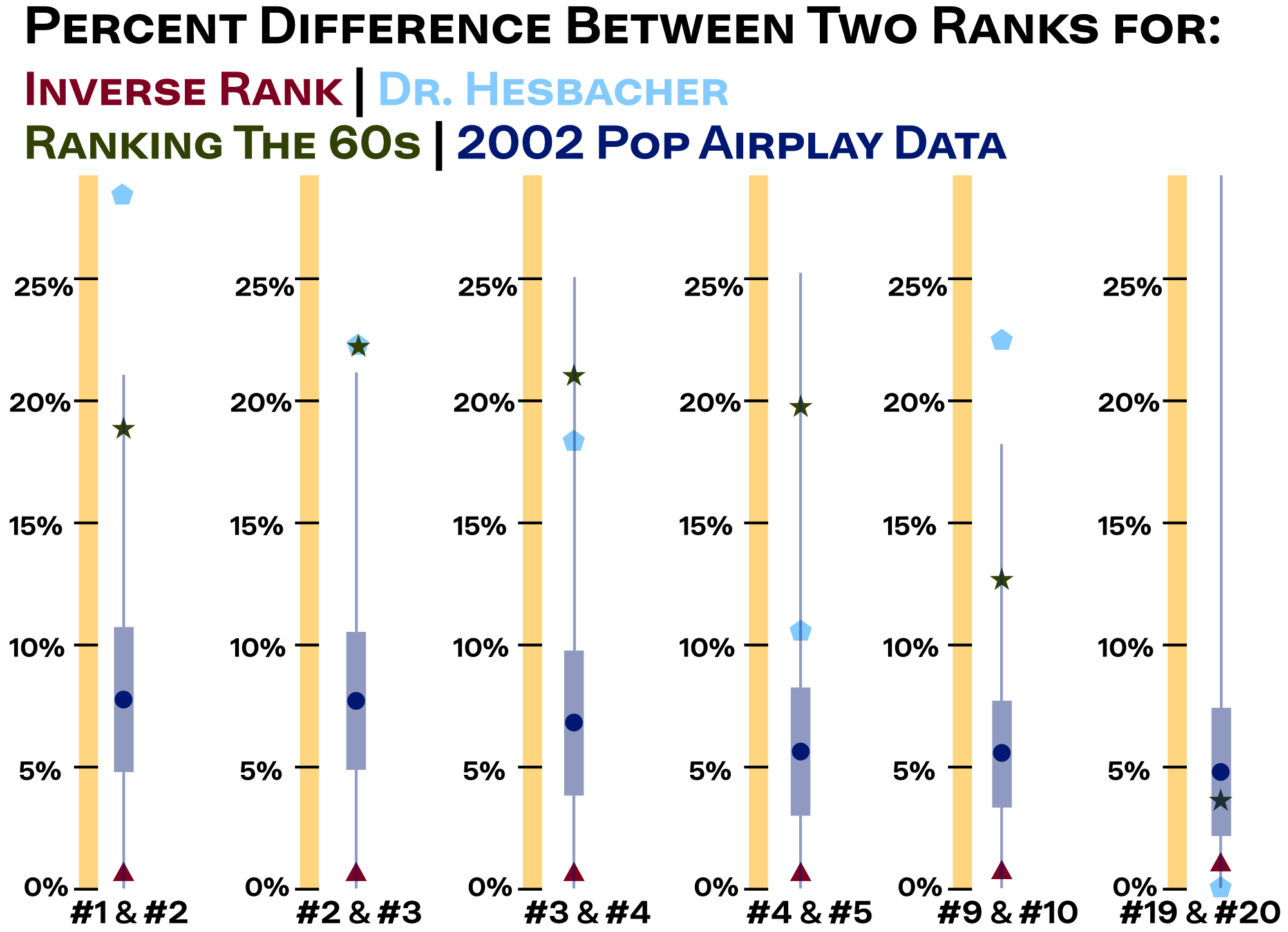
Figure 6. Percent difference in weight between two rank positions for the inverse rank (red triangle), Dr. Hesbacher (light blue pentagon), and Ranking The 60’s (olive star) systems compared with empirical data from the 2002 Radio And Records Contemporary Hits Radio airplay chart (dark blue). For the empirical data, circles indicate the average percent gap, thick bars indicate standard deviation, and thin lines indicate range.
Dr. Hesbacher and Dr. Carroll’s weighing systems indeed resolved the issue of not having sufficienly large increases in weight between consecutive numbers at the top of the chart, but it appears that they may have overcorrected. I found that gaps between #1 and #2, #2 and #3, and so forth were similar on average at around 7%. Dr. Hesbacher’s 25% step up between #2 and #1 in particular appears extreme, far outside the entire range of gaps I found for the entire 2002 year, including weeks where songs that were considered mega-hits were at their apex on the chart. Both Dr. Carroll and Dr. Hesbacher’s weighing system suggests that the gaps between consecutive rank positions increases in positions further down the chart, such as the #9 to #10 gap for Dr. Hesbacher’s system being much larger than the #4 to #5 gap and the #2 to #3 gap in Dr. Carroll’s system being much larger than the #1 to #2 gap. I found no such phenomena. Further down the chart, the gaps between consecutive ranks for Dr. Carrolls’s system roughly matched my estimations.
The empirical data suggests that the weights at the top of the chart should have a ~7% gap between consecutive rank positions and taper to a 1% gap at the very bottom. While there are weeks where one single will greatly perform everything else, one needs to take into account the many weeks where #1 and #2 are neck-and-neck fighting for the top spot–or even tied such as that special “A Thousand Miles” / “Foolish” example. Analyzing the 2002 radio airplay data, I found many weeks where #1 and #2 were very close. I suspect that in the 1960’s there were many moments where the two positions were very close (my eye is on the many weeks where “Louie Louie” by The Kingsmen were at #2).
I think my back-of-the-envelope approach may make sense from a radio airplay perspective. If anything, the gap between #1 and #2 in the 1960s should be tighter as radio pre-1996 Telecom Act was far more diverse and independent, unlike in 2002 where a few conglomerates could heavily push a song simultaneously. However, the information that I lack compared to prior weighing approaches is sales. Here, I have less to go by. I’m not even sure how much weight, relative to radio, singles have on the Billboard formula in the 1960s. The prior weights indicate that it must be substantial at the top, that once a single crests above a score it crosses over from being radio-determinate to singles-determinate.
2. Normalizing each era
Since Dr. Carroll’s scoring system factors in the number of weeks a song charts, eras where singles move on average faster on the chart will have lower scores. Figure 7 shows the number of song entries for each year in the 1960s.
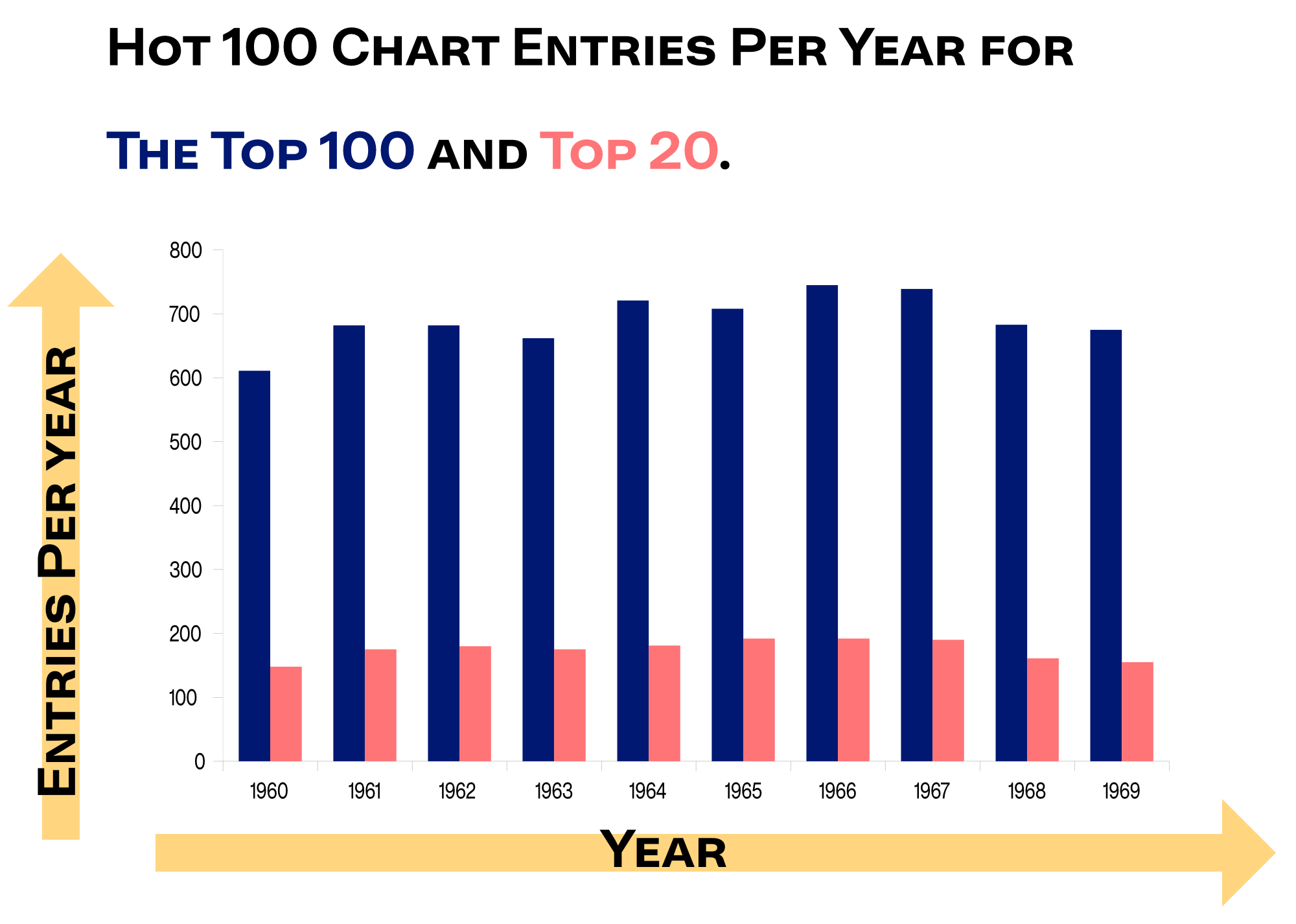
Figure 7. Entries per year on the Billboard Hot 100 (Blue) and in the Top 20 of the Billboard Hot 100 (salmon). Source: Ref 8.
The number of entries dictates the average length a song can spend on the chart, where more entries on the chart mean a fewer average weeks. Indeed, Dr. Carroll observes a dip from an average of 17 weeks to an average of nearly 11 weeks on the Billboard chart as the decade progresses. Since more weeks on the chart allows songs to accrue more points, normaization is needed to ensure songs that so happen to be in an era where chart activity is more rapid or the rules of the Billboard Hot 100 for removing songs don’t create an uneven playing field. This work is, in my view, the most critical part of Dr. Carroll’s analysis and what ensures the results he gets are the most meaningful.
3. Consider any special rules
Dr. Carroll found a strange anomaly in the Hot 100 data upon his analysis for Ranking the 60’s 2.0. Ordinarily on the Hot 100, the highest frequency of peak position is #1, followed by #2, followed by #3, and so on. This phenomenon occurs because a song’s peak position is the highest value it reaches and so, for example, any song that spends a week at #2 and a week at #1 peaks at #1 and the data point where it was at #2 is thrown out. However, for the 1960s and early 1970’s, more songs peaked at a position between 91 and 100. As Dr. Carroll notes:
[Songs peaking at] 16-90 average about 0.9% of all records each. But apparently there were unwritten internal Billboard rules having to do with what a record had to do to exit the 90s. The number of records peaking at 91-99 jumps to about 1.5%. In fact, at 1.8%, Number 91 was the second most likely place for a record to peak–even more than Number 2. This phenomenon disappeared by the mid-1970s.8
Notwithstanding this mysterious phenomenon,13 the most prominent rule of the Hot 100 in the 1960s to consider are the guidelines to when songs get removed. In the “A Thousand Miles” / “Foolish” example discussed earlier, both songs were removed from the chart once they dipped below 20 and had accrued more than 20 weeks on the chart. Such a guideline makes sense since the principal intended audience of such a chart aren’t archivists and hobbyist pop music lovers but people in the business who want to know what the next big song is going to be. By excluding songs that are slowly falling down the chart, room is given to those potential next big hits rising up the charts, which is important information for radio stations forming playlists, labels determining which of their pop stars are going to become big, and those who work with touring in projecting audience size and ticket sales. This process of removing songs as they descend even if they are still sizable hits is not without controversy; Bill Carroll’s Ranking The 90s: Country discusses the deluge of drama as record labels fought each other over such rules for Country radio.14
As of this moment, the Billboard Hot 100 does not employ any song removal rules.15 Back in the 1960’s song removal rules were implemted during some but not all of the decade. Once a song is removed from the chart there’s no place where that information is recorded. To account for these data gaps, Dr. Carroll used songs where the chart information was complete and had a similar behavior as a song with missing gap and then extrapolated the data for the ones where the data was incomplete. Then, a normalization process is done to ensure that the additional points for those songs doesn’t lead to unnaturally high point counts compared to eras where songs weren’t removed.
A Realized Product
Making Final Comparisons
Figure 8 shows the Top 8 songs that Ranking the 60s found through Dr. Carroll’s approach compared to a 2021 ranking of the all time biggest Hot 100 songs, truncated to only the Top 8 songs from the 1960s. I also included a ranking of the Top 8 songs of the 1960s according to streaming data from Spotify.
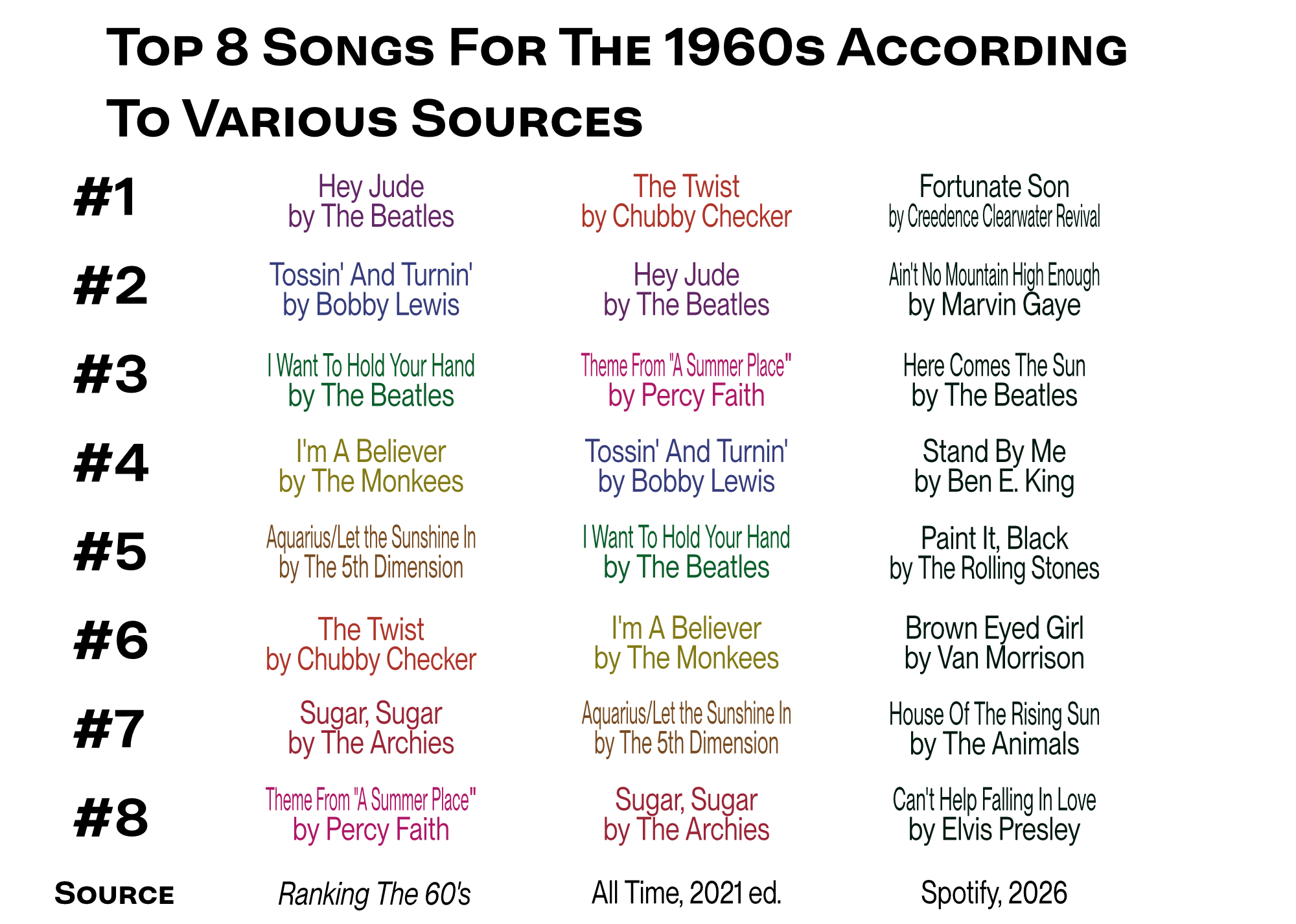
Figure 8. Ranking the Top 8 songs of the 60’s according to Ranking the 60s by Bill Carroll, Billboard’s 2021 All Time list, and August 2026 Spotify streaming (Source: https://kworb.net/spotify/songs_1960.html accessed August 2026).
All eight songs appear on both Ranking the 60s and the Billboard list, though the order is slighly different. “The Twist” appears at #1 on the Billboard list because, though the song was released twice with more than a year gap betwen, it was considered to be one song. Many other lists, such as one used for Ranking the 60s consider them separate songs, hence why “The Twist” appears lower on those rankings. Overall, the good agreement of the two rankings indicates that the weighing and normalization process, while critical to get reasonable data, when tweaked only accounts for songs shifting slightly in position at the top of the chart.
Do these lists hold up to modern ears? Ranking the 60s considers that by making the comparison to contemporary Spotify streaming. I’ve updated the rankings in Figure 8 and find that no song from the Billboard-derived lists matches the current Top 8. While I think part of the reason why there is such a difference is due to some lower charting songs holding up better over time (along with fitting better with popular playlists and being incorporated in soundtracks and advertisements), I continue to express doubts that Billboard’s old measuring sticks and mystery formula for what is popular were adequate in capturing the zeitgeist at the moment. It’s great that Dr. Carroll finds quality data to allow this debate about single longevity to have substance.
Wrapping Up
Data analysts still matter because data needs a human touch to make it meaningful.
There are hobbyists with whom knowing, as precise as possible, the biggest Billboard hits of all time is fascinating. Even if the subject matter isn’t that interesting, the approach that data analysts take is useful in answering many questions. Those questions can be sports related like Who is the greatest basketball player of all time? They can be civic minded like At this intersection, which one is better, a traffic light, a four-way stop or a roundabout? They can be scientific like Are eggs healthy for you? So many questions that come up in everyday life will have their best answers found by reasoning through data and discussions with people who come at the data from different perspectives.
New technology that can better model and run simulations and do AI analyses will make some of the data analysis approach easier, but we will still need analysts who can consider the confounding variables, do proper estimations of weights and errors, know how to best normalize data when taking into consideration potential scaling issues, and have critical reading capabilities to understand all of the rules (including ones that aren’t ever written or spoken). Whether it be music or sports or medicine, the future will still need experts that understand the details and the data that answers the big questions.
-
Still ongoing with its current host Ryan Seacrest. ↩︎
-
The Billboard Hot 100 also includes online streams in its formula after July 2021. ↩︎
-
Radio And Records data comes from this fantastic archive site: https://www.worldradiohistory.com/index.htm ↩︎
-
“Pop” being an important qualifier as “A Thousand Miles” charted highly on Adult Contemporary and Hot Adult Contemporary while “Foolish” charted on the Rhythmic and Urban charts. ↩︎
-
Source: https://www.worldradiohistory.com/Archive-All-Music/Archive-RandR/2000s/2002/RR-2002-08-02.pdf ↩︎
-
ref: Hesbecher, P. L. “Record World and Billboard Charts Compared: Singles Hits, 1970-1979*” Popular Music And Society, 8 (2), 1982. ↩︎
-
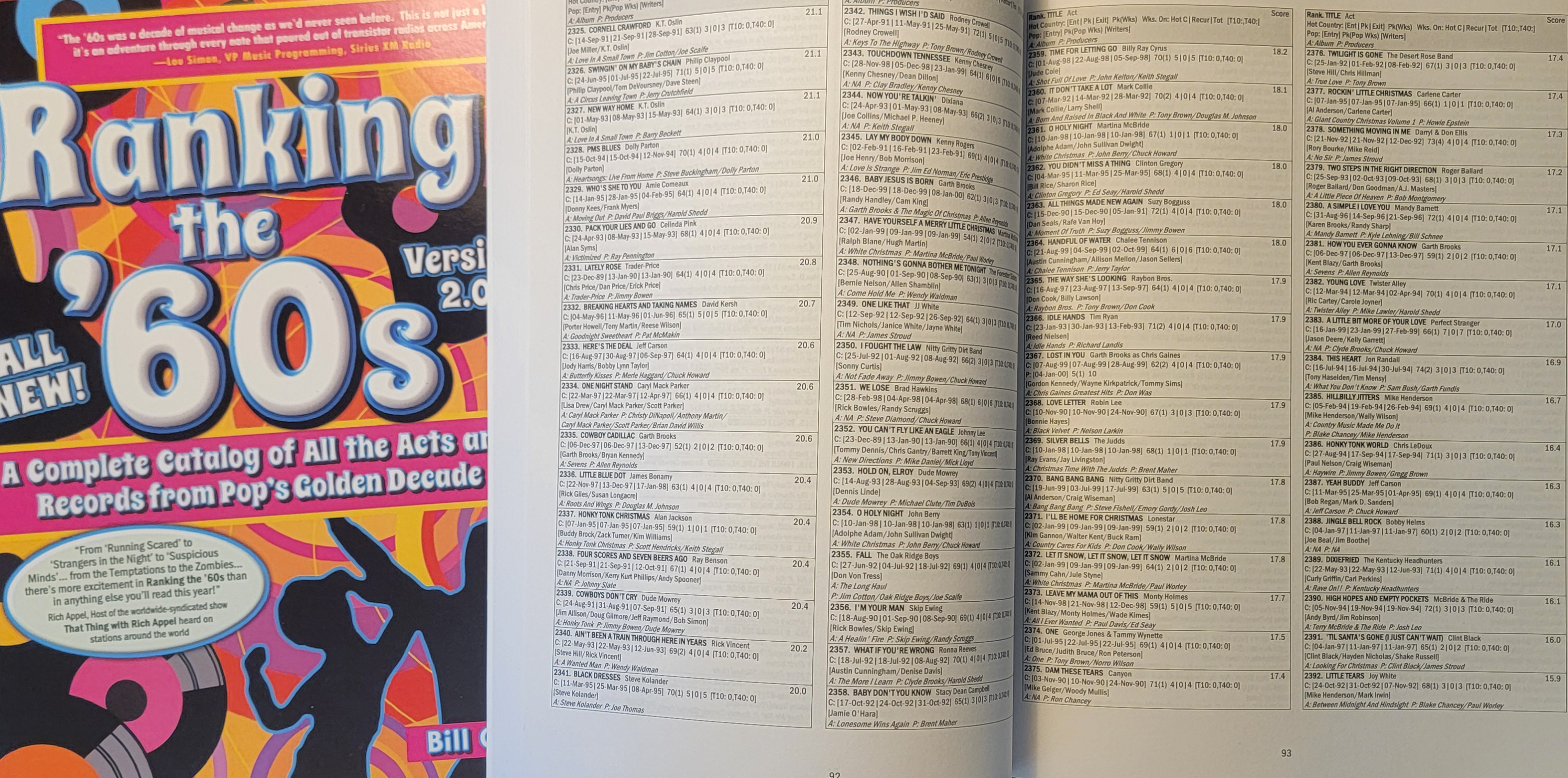
Disclosure: Bill Carroll is a fellow IU alum and mentor of mine. I’ve known and respected him and learned from his wisdom for fifteen years. My discussion of his books must be understood under this conflict of interest. (To be honest, “Ranking The 60’s” is excellent but niche. Though one of the quotes on the cover suggests there is “excitement” to be had, be aware that the book is nearly entirely tables so it isn’t exactly a beach read… unless you are a certain kind of person.) ↩︎
-
ref: Carroll, B. Ranking The 60’s Version 2.0, 2025. (https://ranking.rocks/the-60s-1) ↩︎ ↩︎
-
Later in this piece I’ll discuss the broader impact of this analysis, but I want to note here how each of these three points is very similar to other data analysis situations. For example, when trying to determine which NCAA college football teams are the greatest of all time (an eternal debate… though I am highly partial to IU’s recent season), questions of trying to ascertain what the ceiling is for a #1 team, questions of how small rules can complicate matters, and questions of dealing with statitical inflation/deflation in different eras will arise. Seeing how these challenges are overcome in one area can help those in a different area see potential solutions. ↩︎
-
ref: Carroll, B. Ranking The 90’s: Country, 2025. (https://ranking.rocks/the-90s) ↩︎
-
I am aware it is a bit of a stretch to only consider radio airplay on a specific format and in a different era, but I still think it is worthwhile to try to make as good of a guess as to a reasonable plausible range for what these weights should be. Good data analysts do these sorts of “back of the envelope calculations” where they probe reasonable ranges. This process allows for a metaphorical alarm system to be installed where if the eventual analysis on the data at issue ends up far outside the back of the envelope range, the alarm bell goes off and the analyst recognizes that their analytical approach must have serious flaws they have to deal with. ↩︎
-
The analysis can’t extend below #20 due to the chart’s Recurrent system. ↩︎
-
I notice one other anomaly with the chart rank vs. number of peak recordings data that Dr. Carroll provides for the 1960s, which is supicious small peaks in the noise at regular intervals (e.g. #75, #35, #25, #20). I wonder if the people who constructed the Hot 100 didn’t occasionally slightly fudge data points to get songs to crest to a nice, round number. Though that is merely conjecture. Purchase a copy, turn to page 191, and judge for yourself. ↩︎
-
I think the correct solution is to have two charts, one with the raw numbers and being fully inclusive while the other are the “Hot” charts that remove descending stuff and are considered the more predominantly displayed lists. ↩︎
-
It’s clear they don’t since every year the same Christmas songs inevitably make their return to the chart. If left unchanged (which it may not be, as its current position is controversial), it’s plausible that there’s a future where “All I Want For Christmas Is You” by Meriah Carrey accumulates 100 weeks at #1 by netting 2-5 per holiday season until enough generational shifts and new Christmas songs finally knock it off its perch. (Also, as I am typing this, the #1 song on the Billboard Hot 100 has been on the chart for 43 weeks, which is an exceptionally long time to be on the chart for a #1 hit.) ↩︎